I just wanted to give you a quick glimpse of what I am working on.
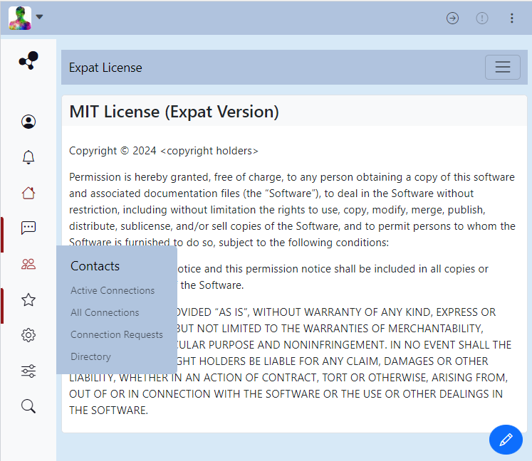
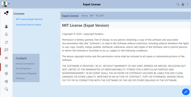
Here is a mockup of the new Redbasic Plus theme. The colors may change, but for this mockup we are using a light steel blue color scheme.
The first release will be very simple and use the existing default templates in
/view/tpl with a couple exceptions.
It just needs a few more things to make it functional, but it is coming along nicely.
This is what it would look like on narrower screens:

This is what it would look like on wider screens:

When you hover your mouse over one of the sidebar icons, a menu appears. Or clicking on the icon itself takes you to a specific page.
Once it is completed and some more testing is done, we plan on submitting it to the Hubzilla themes repository.
Let me know what you think.